
Massachusetts' latest weekly community-level data on the coronavirus pandemic, which no longer includes an updated town-by-town COVID-19 risk assessment map, shows the 16 communities now considered at the highest risk for transmitting the virus.
It's a dramatic decrease from last week after a major change in how the state determines risk of coronavirus transmission. Last week there were 121 communities in the highest-risk red zone; this week's list, which factors in population, has 105 fewer cities and towns there. (See detailed lists below.)
Boston, Worcester and Cambridge are among the many communities no longer in the red. And no communities that have consistently been in red are listed in the report as being required to move back to Phase 3, Step 1 of the Massachusetts reopening plan.
Get Boston local news, weather forecasts, lifestyle and entertainment stories to your inbox. Sign up for NBC Boston’s newsletters.
The town-by-town data was released Friday, after initially being scheduled for release Thursday. The Massachusetts Department of Public Health announced the delay Thursday afternoon without initially offering an explaining.
New restrictions from Gov. Charlie Baker went into effect Friday morning in an effort to stop the virus from continuing to spread in the state.
The weekly data, from the Department of Public Health, includes a breakdown of the total number of coronavirus cases in each Massachusetts city and town, along with more data.
See the Town-by-Town Mass. Coronavirus Risk Data
The following communities are in the highest risk level as of Friday: Brockton, Chelsea, Everett, Fall River, Fitchburg, Lawrence, Lowell, Lynn, Methuen, New Bedford, Norfolk, Revere, Seekonk, Somerset, Springfield and Westport.
Norfolk is the only community that's newly red on the list. It was grey in last week's report.
More than 100 communities dropped off the red list: Abington, Acushnet, Agawam, Ashland, Athol, Attleboro, Avon, Bedford, Bellingham, Berkley, Beverly, Billerica, Blandford, Bolton, Boston, Boxford, Braintree, Bridgewater, Brimfield, Buckland, Canton, Chelmsford, Chicopee, Clinton, Cohasset, Danvers, Dartmouth, Dedham, Dighton, Dover, Dracut, East Bridgewater, East Longmeadow, Fairhaven, Foxborough, Framingham, Freetown, Gardner, Georgetown, Gloucester, Granby, Hanover, Hanson, Haverhill, Hingham, Holliston, Holyoke, Hubbardston, Hudson, Kingston, Lakeville, Leicester, Leominster, Littleton, Lynnfield, Malden, Mansfield, Marlborough, Marshfield, Medford, Mendon, Middleton, Milford, Nahant, Nantucket, Newburyport, North Andover, North Attleborough, Northborough, Norton, Norwood, Palmer, Peabody, Pembroke, Plymouth, Randolph, Raynham, Rochester, Rockland, Salisbury, Saugus, Shrewsbury, Southborough, Swansea, Taunton, Tewksbury, Townsend, Tyngsborough, Wakefield, Waltham, Wareham, Webster, West Boylston, West Bridgewater, West Springfield, Westborough, Westfield, Westwood, Weymouth, Whitman, Wilmington, Winchester, Winthrop, Woburn, Worcester and Wrentham.
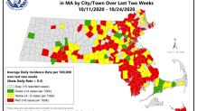
The Department of Public Health is no longer including a map in the weekly report. An official said that the map is no longer seen as being as helpful as it once was, now that coronavirus cases are being seen in most communities.
See last week's map here:
Previously, the state used the number of cases detected on average each day over two weeks to determine if Massachusetts' communities are at high risk for coronavirus transmission. But the new list factors in population size.
To qualify for the red category under the new metrics, communities with populations under 10,000 must have more than 25 cases. For mid-size communities of between 10,000 and 50,000 people, they must have an average of more than 10 cases per 100,000 people and a positive test rate of more than 5%. And for larger communities of greater than 50,000 people, they must have more than 10 cases per 100,000 people and a positive test rate of more than 4%.
Read this week's full report here, with data on communities' percent positivity, county- and state-level data and more.
New Data on Mass. COVID Clusters
Last week, the report introduced new information on coronavirus clusters and where new COVID-19 cases are being found.
It showed that 2,945 coronavirus clusters were detected between Sept. 27 and Oct. 24, the vast majority of which associated with households. They've led to 8,208 confirmed cases.
This week, that data was released on Thursday. Just over 3,600 clusters were found between Oct. 4 and 31 and they've been tied to 10,239 cases, according to the state data. Another 1,720 clusters identified before Oct. 4 were still ongoing into that period.
The state defines clusters are at least two COVID-19 cases associated with one location, and it considers the information useful for learning where people are being infected.
Changes to Massachusetts' Hot Spot Map
Massachusetts has changed how it's measured coronavirus metrics over time, with two significant revamps already last month before Friday's change.
Information on COVID-19 clusters was added last week, and the week before was the first to include coronavirus clusters in institutions like jails, colleges and nursing homes. Such outbreaks have pushed communities into that red zone before.
Communities with an identified institutional cluster are listed with an asterisk, though it won't change whether a city or and town can move forward or backward in Massachusetts' reopening plan or if more people can gather together, according to the command center. The asterisk doesn't change the red or yellow status, either
The color-coded town-by-town data was introduced in August, and the Baker administration announced that the state would focus its strongest COVID-mitigation efforts on towns in the red category. Communities can only move to Step 2 of Phase 3 of Massachusetts' reopening plan, announced in late September, if they are not consistently in the red.
Before the map's introduction, the positive COVID test rate over the preceding 14 days had been the standard for measuring hot spots. The Department of Public Health's weekly report still includes that information, along with other metrics like how many tests are being conducted locally and how many cases have been reported locally.
Some of Massachusetts' smaller towns took issue with being categorized based on cases per capita.
They had said that, when a town only had a few thousand people, an outbreak in just one household could send it into red, which was determined by 8 cases of COVID-19 per 100,000 residents.
Officials said Friday that the latest change to the data was aimed at addressing those concerns.